Naming a typeface is one of the hardest parts of the design process. So for the most part, my projects are known by working titles, often up until very shortly before release: MD Primer was known as Isinglass; Nichrome was originally called Pulp.
For the majority of its development, MD Lórien was referred to as Parallel Caslon. I didn’t intend for it to be a Caslon — rather, it was an exercise in retracing William Caslon’s footsteps: another British type designer analysing the same Dutch sources, and, like him, reinterpreting them to fit both my own preferences, and the standards of today.
Very soon after the introduction of the printing press in Europe, printers in Venice were already laying the foundations of the roman type we still use today. The brothers Johann and Wendelin da Spira, and more famously Nicolas Jenson, had by as early as 1470 produced forms which are readable and familiar to readers some 550 years later. But while those Renaissance models are still widely used as references for contemporary typefaces, they represent the beginning, rather than the end, of the evolution of roman type.
Through the early 1500s, printers and punchcutters developed the Venetian model further — notably, Francesco Griffo (working for the printer Aldus Manutius) cut roman types with a less overt calligraphic influence than their predecessors, as well as introducing the first italics. Later, France — which, after invading Italy in 1495, began to increasingly adopt the roman model — saw influential designs by Simon de Colines and Claude Garamont, among many others. Typefaces cut by the latter (today ‘Garamond’ is practically a genre of type) are clearly inspired by those of Manutius, but regarded as more refined, with a greater harmony to their proportions and spacing.
In the 17th century, however, it was not France but the Netherlands that came to dominate the printing trade — by some estimates, more books were produced in the Dutch Republic during that century than in all other countries combined. And this new era of printing brought with it a new style of type.
The Dutch Taste (or goût Hollandois) came to be defined by a bolder appearance with higher stroke contrast, a taller lowercase, less bracketed serifs, and a rhythmic emphasis — though I find that the difference is often more in feeling than in counting specific details. The Dutch typefaces from this Baroque era feel crisp and almost contemporary, with far less of the ‘scribal’ feeling present in earlier designs.
Christoffel van Dijck (c. 1600–1669) is perhaps the most widely cited example (possibly thanks to a 19th-century misattribution to him of many typefaces used by the legendary Elsevier printing dynasty), although Dirk Voskens (1647–1691) and later his student Míklos Kis (1650–1702) cut notable examples in the same style.
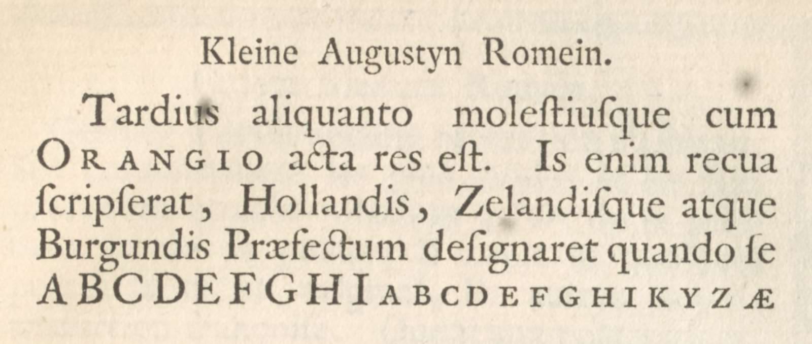
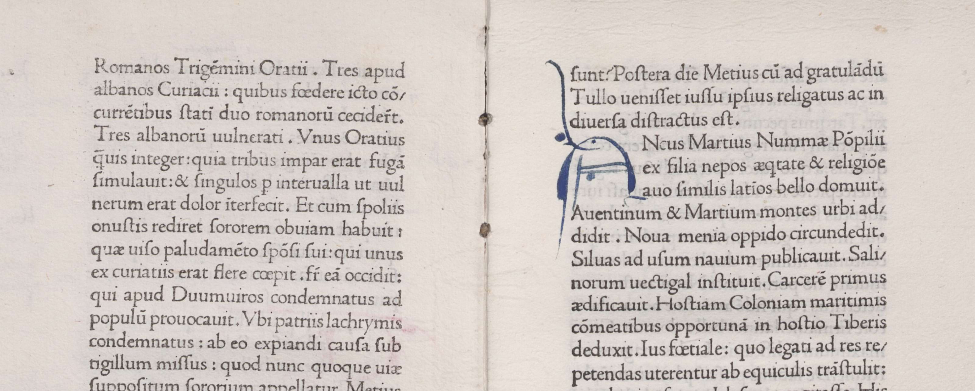
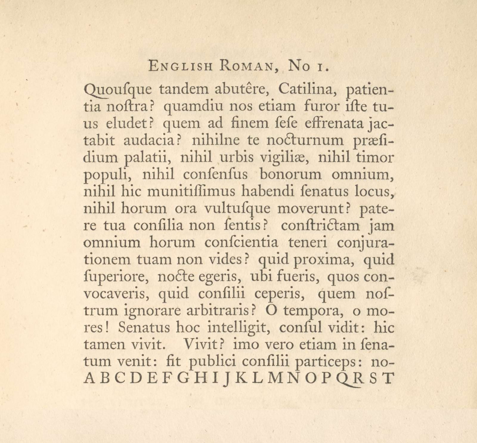
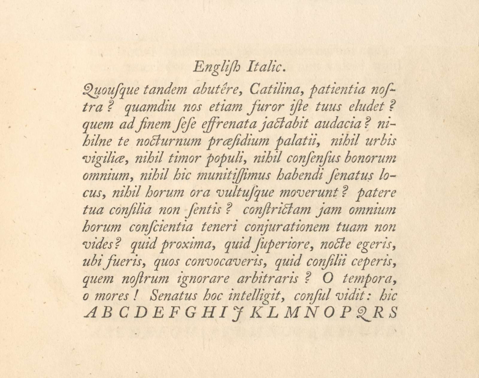
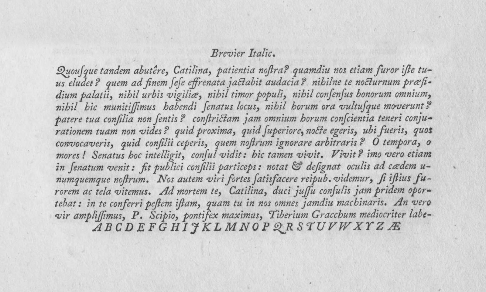
It was on these Dutch typefaces that the British type designer William Caslon I (c. 1692–1766) based his own, the first examples of which date from the mid 1720s. Back in the early 1670s, John Fell, then Bishop of Oxford, had imported fonts from the Netherlands for the Oxford University Press, lamenting a lack of good examples in Britain; seemingly little had changed by Caslon’s time, and type from the Low Countries still dominated the English market.
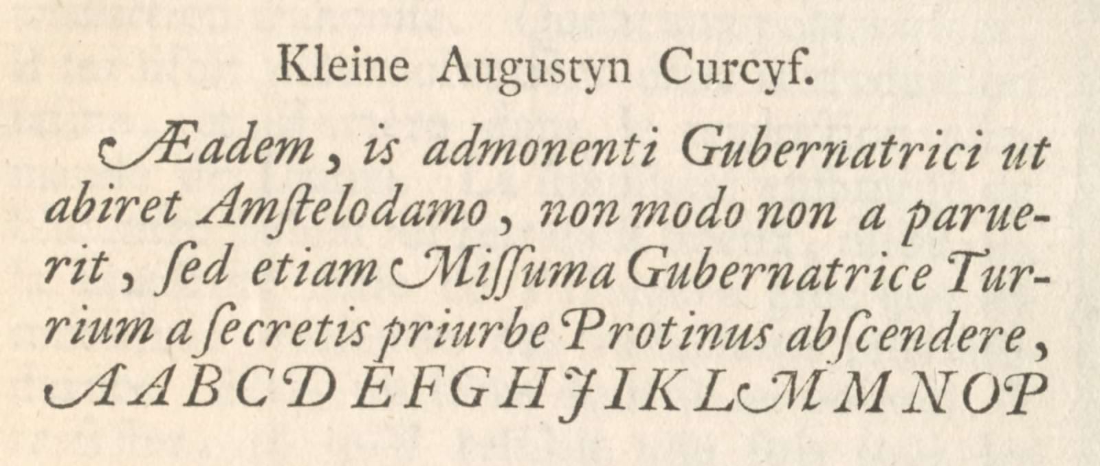
That would change as Caslon began producing his own type. His faces were relatively conservative: though they retained much of the goût Hollandois in their proportions and weight, they further simplified details — knocking the spur from the G, smoothing out serifs and making uniform the italic strokes which, in earlier examples, often ‘danced around’ a common angle rather than following it precisely.
Their popularity was remarkable. In the British Empire, Caslon’s work was credited with ending the Dutch monopoly on printing type, and its longevity was secured in part by its adoption throughout North America. The legacy of Caslon is difficult to overstate, with dozens of later typefaces bearing the name and countless more being inspired by the originals’ design.
But in the Netherlands, at around the same time, the typographic style had moved in a different direction. By the early 1700s, the industry had waned almost to nothing — but in 1728, the German-born punchcutter Johann Michael Fleischmann (1707–1768) began working for the type foundry of Hermanus Uytwerf, in The Hague, and the following year had completed the first of many typefaces in a style quite unlike those of the previous century.
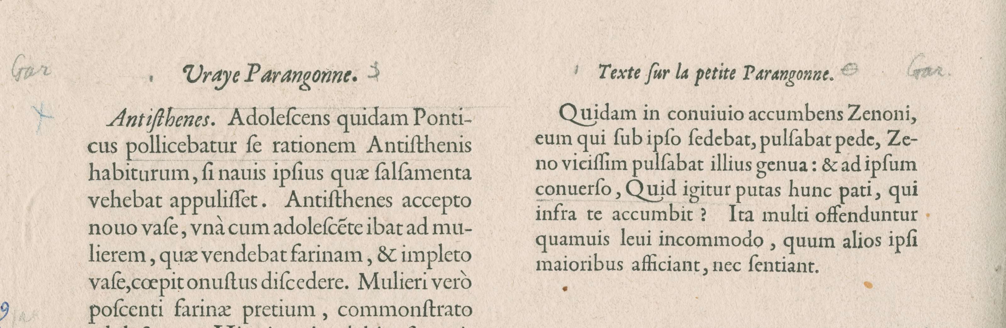
Fleischmann’s types, which he would later begin producing independently for other foundries (his biggest client being Enschedé), counter Caslon’s straightforwardness with an ornate, detailed construction. Their serifs are cupped or even deeply scalloped; their predecessors’ teardrop shapes in glyphs like a and c give way to ball terminals which sparkle in running text. And a more vertical axis of contrast, with a highly-symmetrical o, gives his roman typefaces a graphic appearance far more abstracted from calligraphy than even Caslon’s.
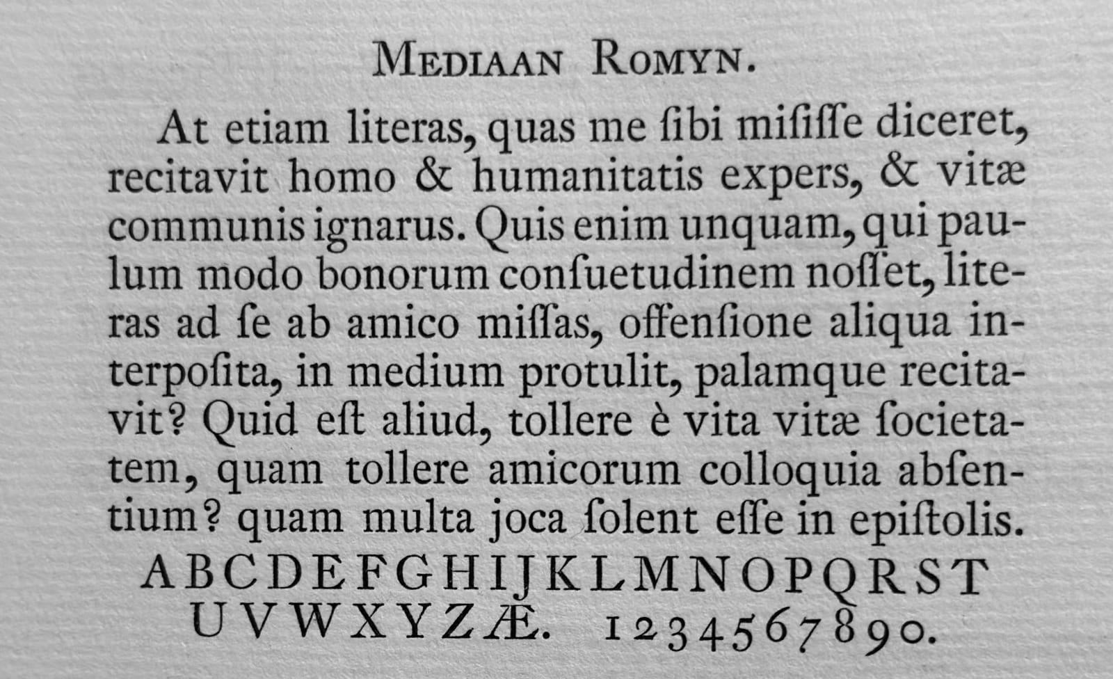
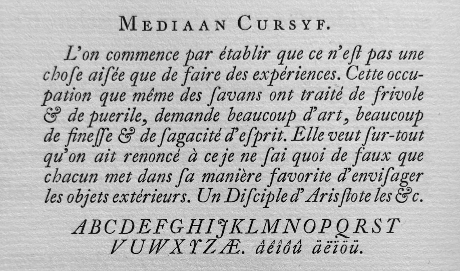
I’m not a great type historian — and while I always try to be informed by the past, I’m not reverent to every detail. In designing MD Lórien, I therefore allowed my influences to wander forward in time from those of Caslon, embracing the glittering details of Fleischmann’s typefaces (albeit selectively).
In essence, I wanted to find a balance between three factors: the rhythm and feeling of the 17th century Baroque types; the sparkle of Fleischmann’s designs; and the need for a contemporary text typeface to be familiar and readable by the standards of today.
I think a good typeface is always designed for a specific use case. That can be an extremely singular context (“The bylines and page numbers of a horticultural magazine”), or a much more general one (“User interfaces on digital screens”) — and it’s expected that, often, most or all of the typeface’s actual usage will differ — but there should always be a target to aim for. It helps to understand the environments in which the design needs to work, as well as its priorities: a book typeface should be comfortable to read at 10pt for a long time; a typeface for nightclub posters should catch your attention at 100pt.

From the very first drawings of MD Lórien, it was a typeface for text. Like Caslon, and like the Baroque serifs I was primarily referencing, that predominantly means books, though in the 21st century there are simply more media in which a typeface needs to work than at other times: magazines and websites are expected of all but the most situational of designs. By designing for text generally, rather than a single medium, I wanted to create something fundamentally versatile: a typeface optimised for longer paragraphs at relatively small sizes, rather than hyper-specialised for a narrow use case.
As is becoming a habit, I found myself drawing the Regular weight to be slightly on the lighter side, so that it doesn’t end up too heavy when printed with a little ink bleed (or when viewed white-on-black on screen). To complement that, the Book weight is only a half-step up; a darker Regular rather than a full movement towards Bold. Between the two (even literally in-between, using the variable font), Lórien can work in a fairly wide range of environments.

Maybe the single most vital thing about a text typeface is that it can’t be distracting. As soon as the reader notices a particular glyph, they stop reading. So the process of designing MD Lórien was, even more than usual, an exercise in balance: the source material I was looking at is, in places, elaborate and decorated — Fleischmann’s scalloped serifs and delicate ball terminals — and I didn’t want to eliminate that; but to leave it unchanged would result in a typeface that, at least for many readers, would be distractingly ornate.
One of the tricks I discovered during testing is that the threshold for ‘distracting’ differs from one glyph to another. The most frequently-used letter in English, E, has a pretty narrow margin of error: make the crossbar too long, and it’s immediately visible. But the tail of the Q, or the leg of the ampersand, are much more forgiving, and it’s here where I kept (or even added) much of the ornament which gives Baroque typefaces their character.


That allowed me to tone down the more unconventional details elsewhere. I didn’t entirely smooth out the serifs of E and L, but I found a solution that suggests the more complex shape of Fleischmann’s. Instead of ball terminals, I opted for a half-cut teardrop shape (in fact, I’m inclined to think of this as one of Lórien’s defining details), a more flexible motif which returns a little of the sharpness I’d been removing elsewhere.
All translations are opinionated, and typefaces are no exception. I’m therefore not precious about keeping my own interpretations of typefaces “true to the original”: that’s a valid ambition for many, but I’m far more interested in the challenge of adapting historical typefaces to contemporary usage.
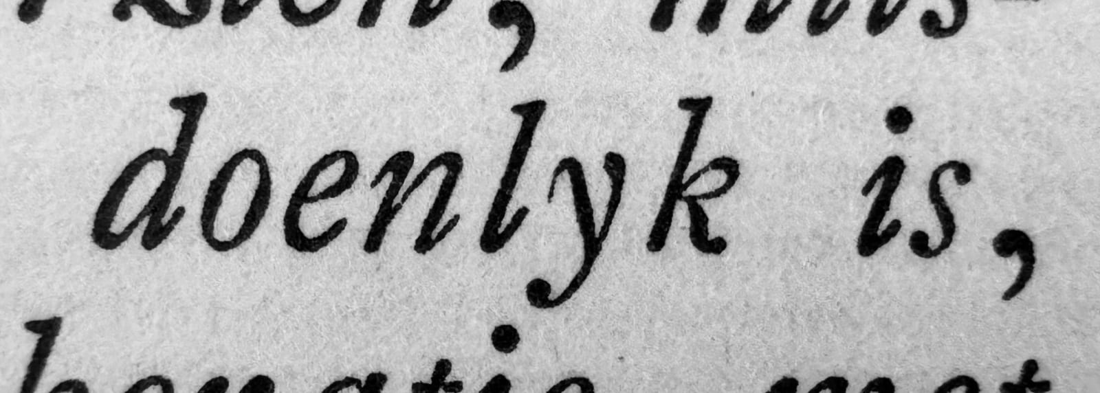
So for a few key drawings, it was helpful to reconsider whether the source material was the right model at all. Some glyphs, like the lowercase g or italic k, simply didn’t suit a literal adaptation. Instead of faithfully copying these, I came up with new shapes, not found in the examples I was drawing from: in MD Lórien, the g’s ear flicks up, not down, to let more air into the shape; the fussy loop of the k is instead suggested by an inward curve.

And by necessity, that arm’s-length approach to source material extended into the wider parts of the glyph set. While the typefaces used by printers in the 18th century Low Countries really only needed to support a handful of locally-spoken languages, a contemporary type family has a global reach. MD Lórien has the widest language support of any typeface we’ve produced to date, along with symbols for 19 currencies, full small caps, italic swash caps, and more — over 1100 glyphs in each style.
Not only is there no historical reference for the majority of those drawings, too closely following any existing example can unintentionally ossify some Western-Eurocentric ideas: classically tall uppercase letters that work for European languages might not leave space for the stacked diacritics in Vietnamese, and the wide, ornate k, x and z that occasionally punctuate older Latin or English texts are disruptive in languages where those letters are used more frequently. With that in mind, I tried to consider many of Lórien’s glyphs and metrics independently of the source material (though I’d compare afterwards and occasionally make adjustments).
As well as individual glyphs, MD Lórien’s other significant departure from historical models is in weight. The idea of a regular-weight typeface having an accompanying bold has only become popular within the last century or so, and the references I looked at were all cut in a single weight only.
While I’d made some sketches for bolder weights, I initially wasn’t satisfied with the interpretation. I’ve drawn serif typefaces in the past, but I’ll admit that I was out of my comfort zone without any reference material to lean on — I was therefore glad to be able to collaborate with Manuel de Lignières, a type designer with more experience working on historical serifs, to define the look of Lórien’s bold styles.

In some ways, bold weights like this are always a compromise between contemporary requirements and historical ideals. But in this case, I think there’s less compromise than usual. To ensure an even balance of weight between thick and thin strokes, bolder styles tend to have a more pronounced ‘picket-fence’ rhythm, with a strongly vertical axis of contrast — is that not, in a way, just a continuation of the Dutch taste? And to maintain consistently-sized counters within each letter, the widths of typically-narrower glyphs like a and s become closer to the n and o — like they do in Caslon’s work.
For the Bold Italic styles (an even more modern concept), I worked with Huw Williams to translate the italics’ lively texture into heavier weights, the more apparent thick–thin contrast of which can be quite unforgiving. Glyphs like the w (which in the lighter styles hides fairly well the fact that its contrast axis is rotated) needed much more careful tuning to work in the bold.

With a full range of weights established, and the concept for much of the typeface complete, there was one final thing I wanted to add.
By Van Dijck’s time, it was the norm for italic capitals to be based on the upright caps, while adopting the same slant angle as the lowercase. However, not every letter followed this ‘sloped-roman’ structure: commonly, J, Q and Y would be more elaborate swash versions; sometimes several others as well. While I think this motif is, nowadays, too unconventional to be the default, I did want to include it as an option in my typeface — Caslon’s and Fleischmann’s italics both feature it, too.

So I drew an alternate swash variant for the italic J, Q and Y. And then I thought, why not do the rest, too? — so I also drew the rest.
And then, since some swash constructions didn’t allow for diacritics, or crashed into adjacent letters, I drew alternates for a handful: the L and Q tuck in their tails to avoid colliding with descenders; the right hand side of the A becomes a conventional stem when a diacritic or ascender gets too close.

Along with a couple of related features (like flourishes for certain letters at the end of words, the ct and st ‘ties’ found in many serif italics, and the as, is and us ligatures from Van Dijck’s designs), the result is a richly textured set of italic styles. I didn’t design MD Lórien for use at display sizes, but this set of italic features gives it a good set of text-scale options for catching attention when it wants to.

There’s plenty I still haven’t discussed, from Lórien’s small caps and ligatures, to the fact that it’s the first Mass-Driver release to support Vietnamese, to how there’s also a full set of lowercase ordinals (that’s another 1st). But I think it might be better to let the typeface speak for itself.
You can find more info, like the full glyph set and list of OpenType features, in the PDF specimen. And you can download a trial version of MD Lórien for free — our trial fonts aren’t subset or restricted, so all the features I mentioned are included for you to test.
Licensing starts at €50 for commercial use, and variable fonts are available (on request) if you purchase the complete family.