Recently I published MD Primer, a new grotesque typeface in six weights. I’ve described it as a ‘digital reinterpretation of the flaws and inconsistencies of early sans-serifs’ — in this post I’d like to cover in a little more detail what that means. I’ll also highlight some of the specific features and rationale behind the design, which draws from historical sources in a very consciously digital way.
Just as the shape of a writing tool influences the marks it creates, so too does a typeface carry traces of its method of production. A metal font, the standard for half a millennium, is the result of a complex set of analogue processes, each one leading to some change in the resulting typeface.
Although it’s perhaps less apparent, digital typefaces are just as influenced by the technology behind them. Not every shape that can be cut in metal can be drawn with vectors (at least, not feasibly), and vice versa.
This is one of the fundaments behind the typographic idea of revival: the process of translating a typeface from one technology to another. It’s an extremely involved process — not everything from the original can be maintained, so the type designer must decide which elements to keep, which to leave, and which to adapt for the new medium. If you’ve ever wondered why the digital version of a typeface isn’t the same as the original (or why there are so many versions of Garamond) this is likely the reason.
For a long time, I’ve had a kind of obsession with early grotesque typefaces.¹ There’s no particularly universal feature among this group, but a general commonality is their sense of roughness: the notion that something about them, from their proportions to the details of their glyphs, is somehow unrefined. Perhaps their uppercase is too bold, or their A too narrow, or the terminals of their C and S too different.
Whether these imperfections come from the novelty of the grotesque style, or from the naivety of the typefaces’ creators, they are seldom represented in digital type. Given how involved and how personal the revival process is, if one of these typefaces is digitised at all, the mistakes and hallmarks of analogue type casting rarely seem to cross the technology gap. If they do, it is through deliberate effort.
I think that is what draws me to these typefaces most of all: despite the abundance of grotesque and sans-serif typefaces in digital formats, and no shortage of naively-drawn ones, only a tiny fraction of contemporary grotesques capture the very specific imperfections of the 19th century designs. Even fewer do so without adding their own flaws, telltale hallmarks of the digital process. MD Primer is my response, a typeface celebrating the imperfection of the analogue fonts of the 19th century, but designed from the start to work with the grain of digital technology rather than against it.
From the very beginning, that idea of Brutalism — playing to the strengths of a material or medium — was core to the design of MD Primer. It’s relatively easy to imitate the roughness of a printed edge or the uneven black of ink on paper using digital technology, but not in a way which stands up to scrutiny, and not without quite seriously limiting the practical usability of the typeface. My desire was to recreate the very analogue feel of metal type, without copying the literal roughness of the shapes.
I was also not particularly interested in reviving any specific typeface. Since I began this project in mid-2020, doing so without first-hand access to specimens and references would have been difficult anyway. Rather, I wanted to capture elements from various sources and consider them in the context of contemporary type design.
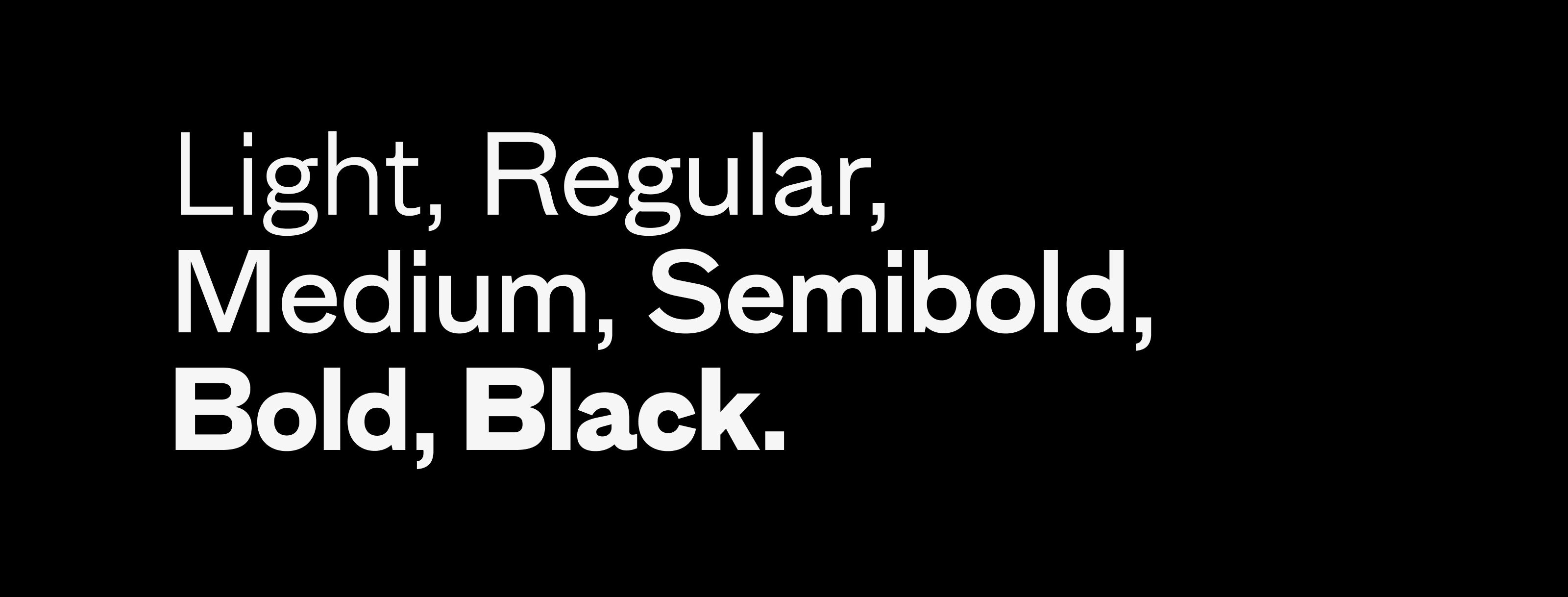
Most of my designs begin with a regular weight. Logically, that’s an efficient starting point: it’s often the style that most defines a typeface’s character, and in running text typically needs the most work. An intermediate style like a semibold is normally one of the last to be defined: it’s derived, a lot of the time directly through interpolation, from the regular and bold weights.
With MD Primer, I inverted that process. The 19th century typefaces I was referencing were often available only in semibold (or medium, halbfette, etc.) weights. Certainly the ‘intermediate’ weights seemed the most typical of the style. So despite the inefficiency, I was quite determined to begin there, in the middle. In hindsight I think this was the right decision, even if it led to MD Primer’s nine-month development time.
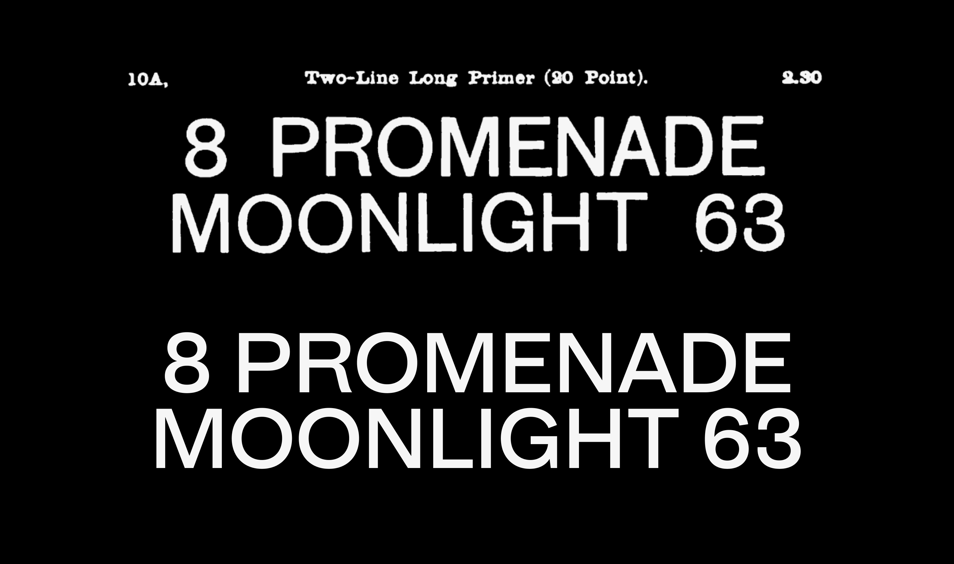
(N.b. ‘Moonlight 63’ in the scan is from the 24pt size, scaled down digitally.)
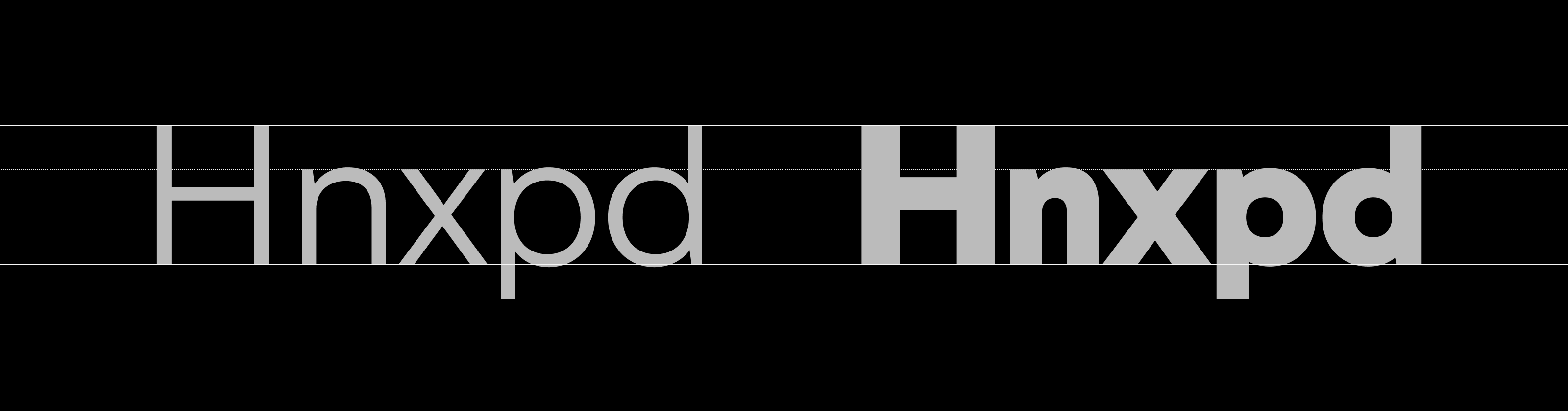
I think one of the most unique expressions of a typeface’s identity can be found in its proportions: the length of its ascenders and descenders, height of its capitals compared with its lowercase, and particularly the relative widths of characters.
Among more recent designs, particularly neo-grotesques, the tendency is for letter widths to be very even, and for a relatively tall x-height. In the earlier designs, the lowercase tends to be smaller compared with the caps, and the caps themselves are often quite varied in proportion.
I tried to strike a balance closer to the 19th-century examples for MD Primer’s uppercase — an overall sense of syncopation rather than consistency, with a very circular O and an H that doesn’t totally match its width. This disharmony in width is something I pushed even further with the numbers, which are substantially narrower than the caps across all weights of the typeface.²
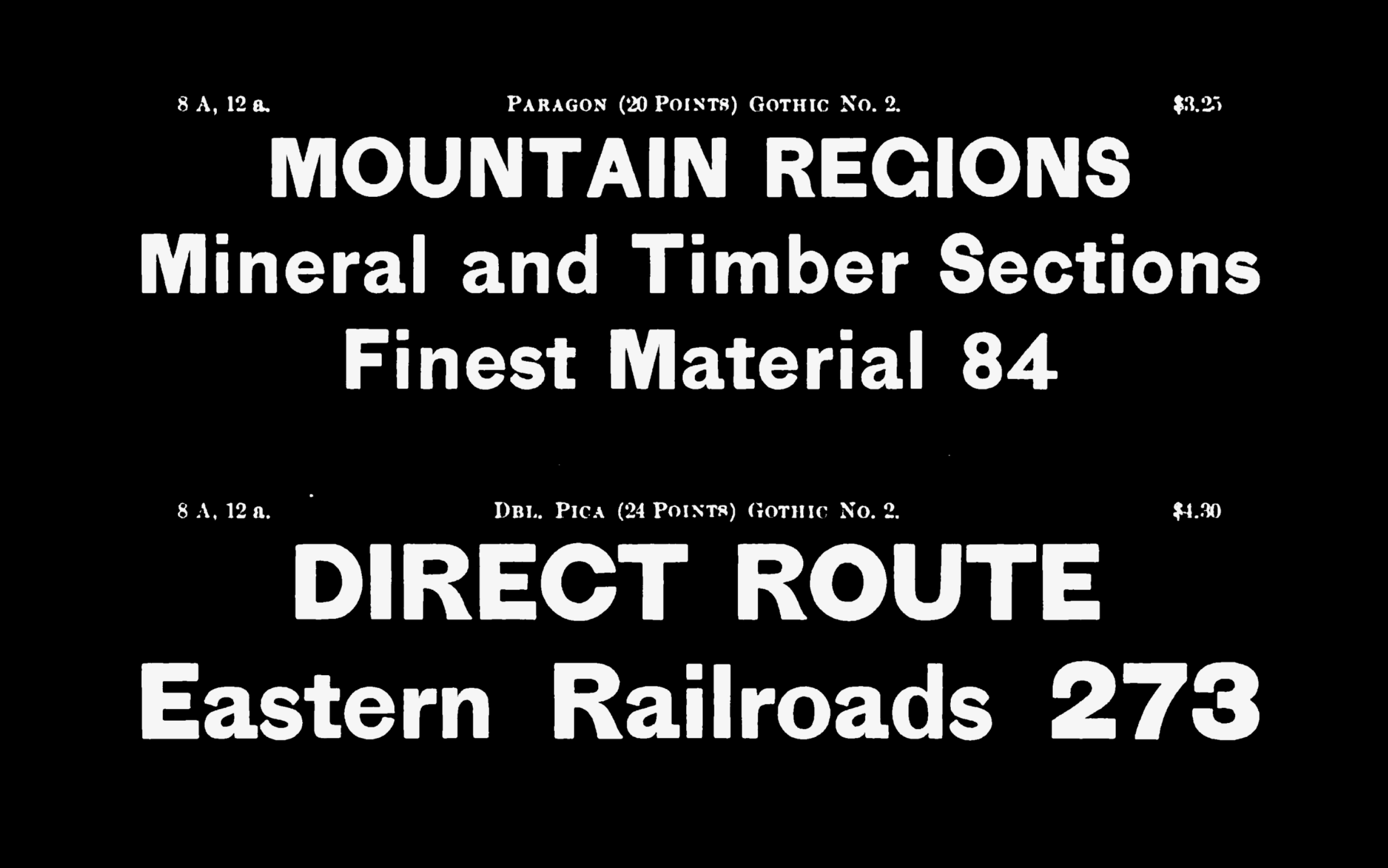
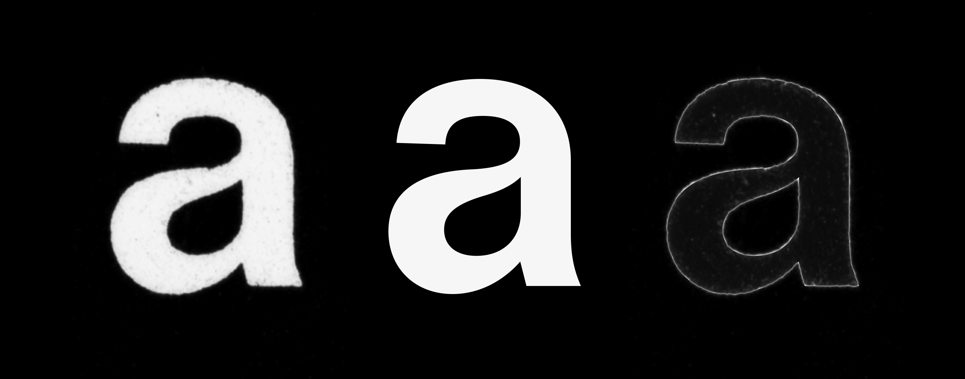
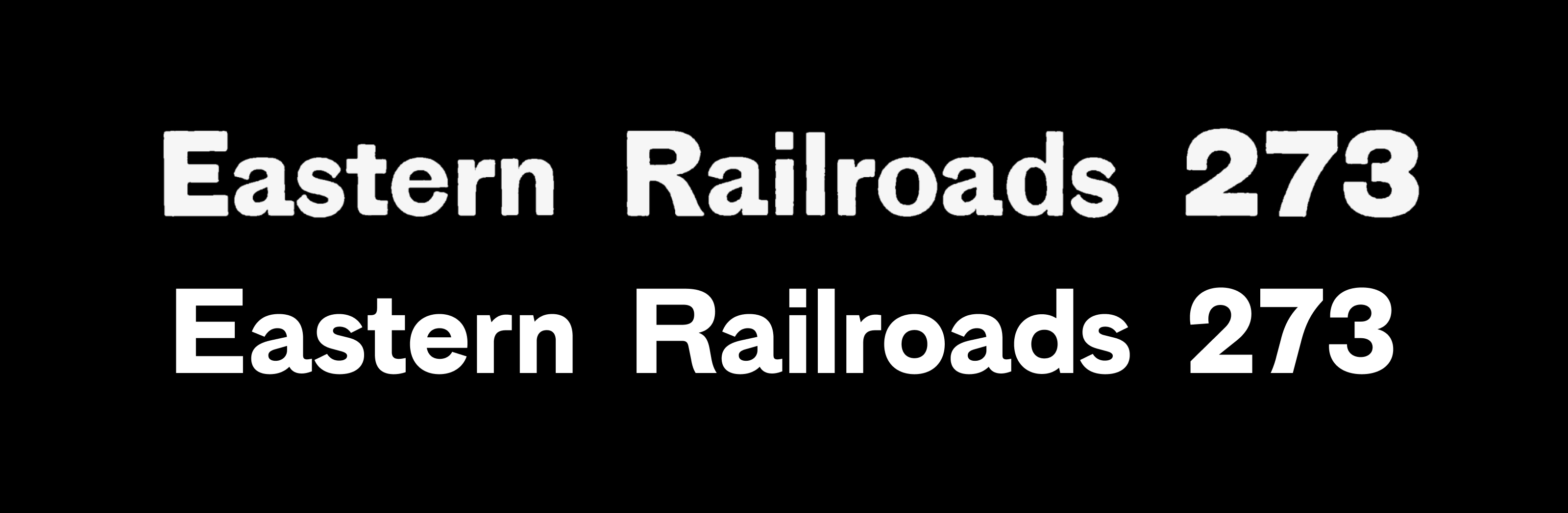
In the vast majority of Latin typefaces, uppercase letters tend to be slightly bolder than lowercase ones, to compensate for their tendency to ‘feel’ slightly lighter. In some designs, particularly those produced before the 20th century, this effect can be extremely pronounced. Gothic No. 2 (sold by the Cincinnati Type Foundry, though perhaps originally from elsewhere) is one of my favourite examples of this: the caps seem to tower over the lowercase, both taller and bolder than the flimsy minuscules.
I was concerned about incorporating that feature too closely in MD Primer, since to a modern reader I think it can be quite jarring, however I was confident about replicating some aspect of it. The uppercase characters in MD Primer are drawn right on the edge of what I considered ‘too bold’,³ not so far from the weight of the lowercase as to be distracting, but enough that (combined with their relatively large width and height) they give an impression of greater gravity.
Designing a typeface is largely about creating visual consistency between elements — not only the letters of a typeface, but also their constituent parts, and even the spaces between them.
In many of the references I looked at for MD Primer, the terminals (the endings of strokes) and apertures of letters present something of an exception to this. Typically, a well-made typeface would endeavour to harmonise these elements: if the terminals of the C are near to horizontal, and the aperture closed-off, you’d expect the terminals of the S to be similarly tucked-in. In many of my references, this was not the case. Halbbreite Groteske-Versalien (1889) — a typeface by the foundry of Benjamin Krebs Nachfolger which I looked at closely for this project — has a C with a very narrow aperture and terminals exactly on the horizontal; however the terminals of its S are entirely different, swinging open at upwards of 40° in some sizes.
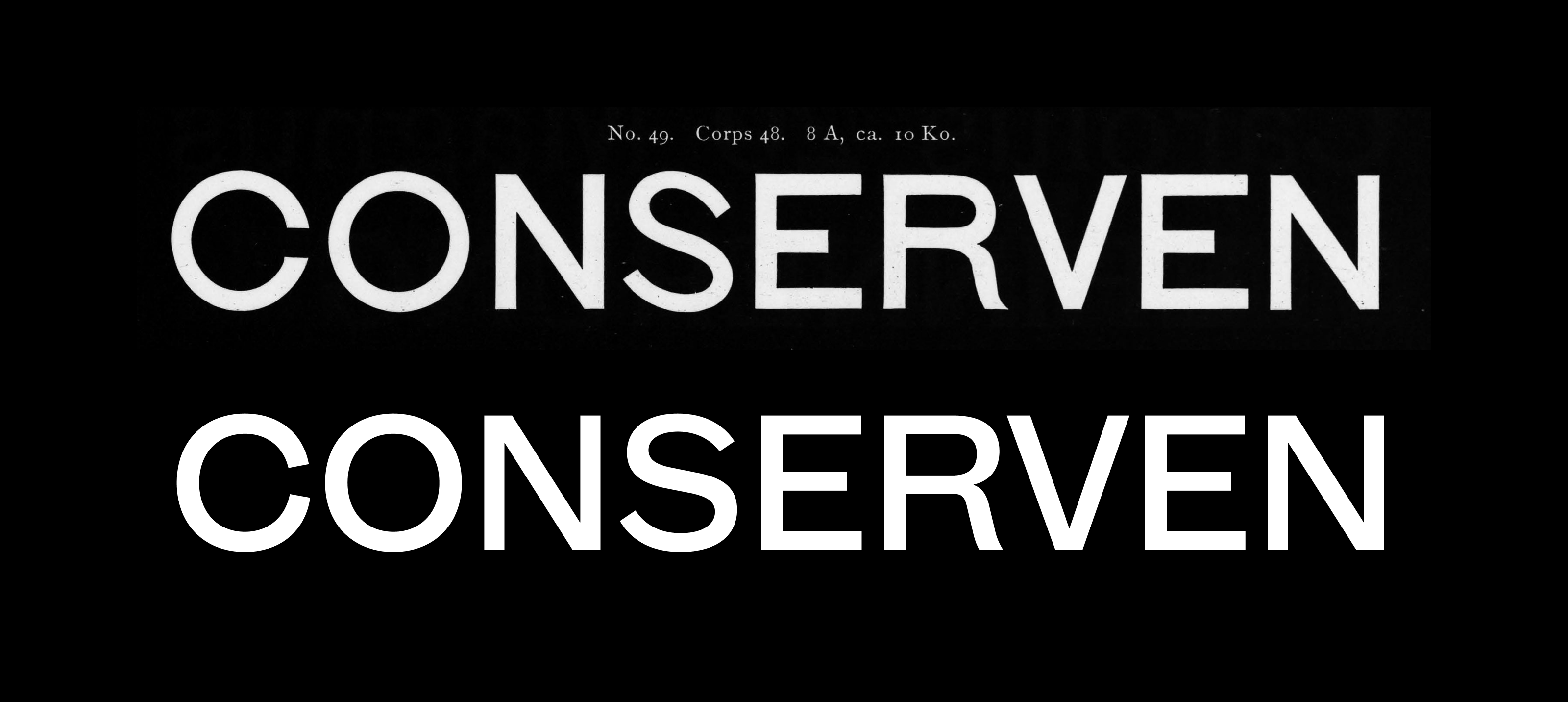
(The Krebs design was also a reference for MD Primer’s uppercase R, as is somewhat apparent here.)
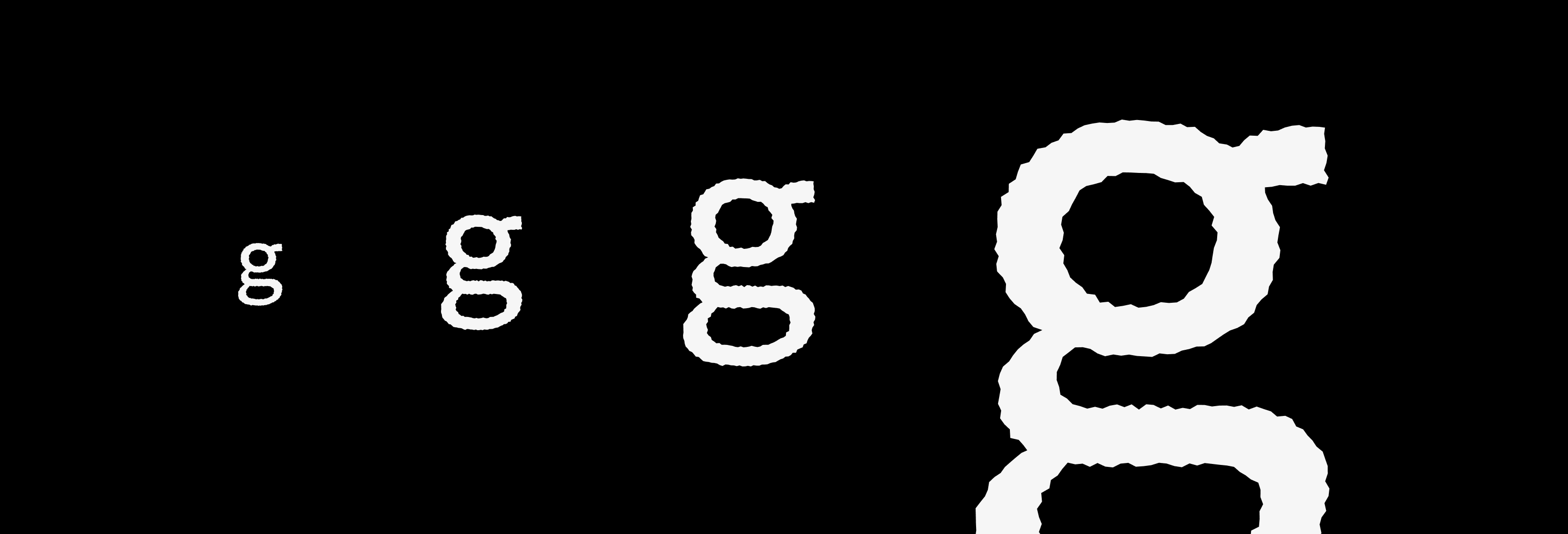
As with the weight and size of the capitals, I was hesitant to incorporate this motif directly in my own typeface. I kept the terminals of both letters away from the horizontal, maintaining at least some harmony between them, while still keeping the C decidedly closed-off and the S decidedly open. I explored other disharmonies like this elsewhere in the design, like the double-story g which, especially in the heavier weights, is just a little more calligraphic than what the rest of the design invites.⁴
Typically, the ascenders and capitals of a typeface are slightly different in height — usually the ascenders are a little higher. In MD Primer, both ascenders and caps are exactly aligned (as are the dots above i and j, and some lowercase accents). This is a feature also found in some of the 19th-century typefaces I referenced, which I found particularly useful in settings with very tight line spacing.
Less historically precedented is how MD Primer’s x-height remains the same across the weight axis. In almost every typeface with multiple weights, the relative height of lowercase letters increases in line with their boldness — this is to compensate for an optical effect working in the other direction, whereby the bolder characters look slightly smaller than they actually are.
In MD Primer, these compensations are intentionally left out: the subtle mismatch this creates plays to the disharmony which is core to the design, and the optically-smaller lowercase in the boldest weights only accentuates the effect of the caps towering over it.
Some smaller details: the slightly-too-curvy leg of the capital R was common among the designs I referenced, which I chose to also mirror in the 7 and in the alternate lowercase j.
The number 0 is capsule-shaped to distinguish it from the capital letter O. This is not reflected in any of the other numbers (though it does appear in the € sign), again to accentuate the motif of disharmony — however the zero is very carefully matched in curvature with the uppercase letters U and O, to prevent this disharmony from becoming too jarring.
The horizontal strokes of letters f, g, r & t are designed to align seamlessly. This is personal preference rather than any specific historical reference.
Finally: on the web, MD Primer is set up to be (approximately) centred on its bounding box, so buttons and line-heights should be more straightforward to set. This will obviously depend on the particular text and its casing, but is designed to be generally appropriate.
MD Primer is my first full release since the launch of Mass-Driver in 2020. It was a pleasure to work on over the past several months, all the more so thanks to the people I had the opportunity to work with and get feedback from. I’d like to particularly thank Luke Charsley and Céline Hurka for their feedback throughout the design process, as well as Dan Reynolds for so generously sharing both his expertise and his research on 19th century designs.
MD Primer was released in May 2021, alongside a new licensing model designed to be both fairer and more permissive. You can license the typeface from €50 for commercial use, with free trials also available.
→ Buy MD Primer
→ Download PDF Specimen
Halbbreite Groteske-Versalien scan: Dan Reynolds, ‘Database of sans serifs sold in 19th-century Germany’, TypeOff.de (last accessed 12 July 2021).
Scans of Gothic No. 7 and Gothic No. 2 courtesy of HathiTrust (www.hathitrust.org). (last accessed 12 July 2021).