What does it mean for a typeface to be useful?
This is the question at the heart of MD System’s design. How do you give a typeface the greatest amount of utility, without taking away its character?
I think the first step in addressing it is recognising that the word useful has two meanings. A typeface can be useful in the sense that it’s stylistically versatile: it works in a broad range of contexts and environments. It can also be useful in the sense that it’s usable: convenient and practical to work with. I wanted MD System to be both.
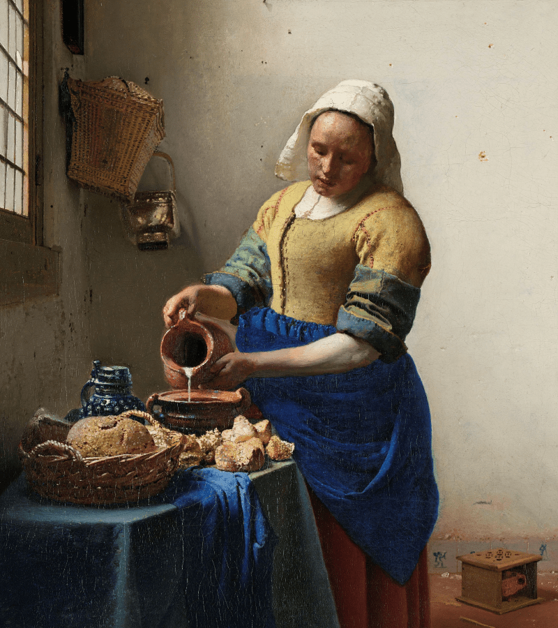
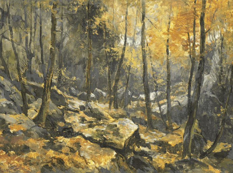
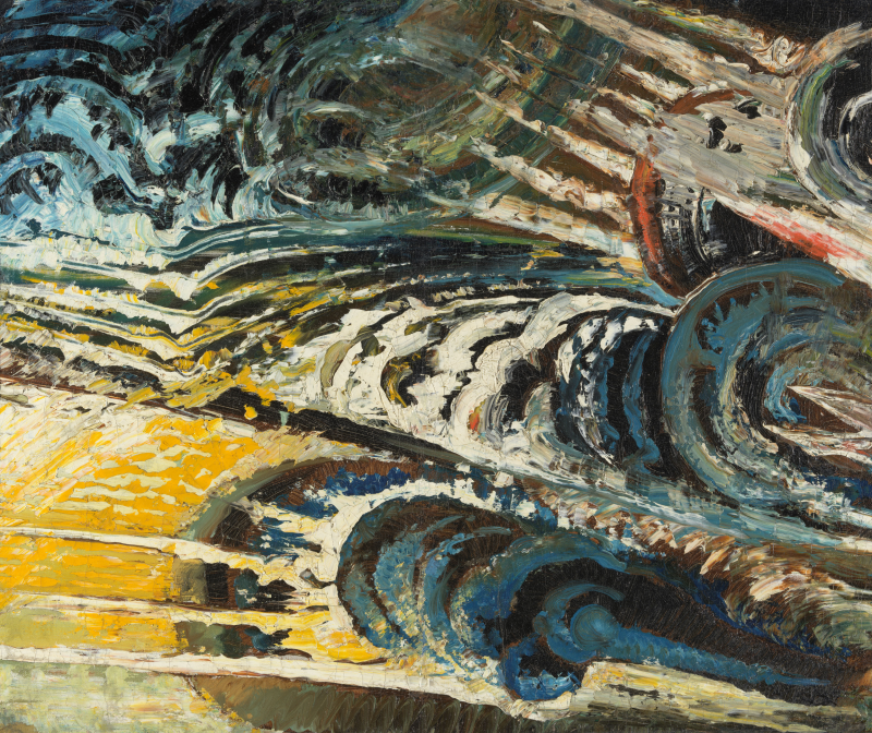
There’s no such thing as a neutral painting. What would it look like? A portrait carries all the associations of the subject, their costume and surroundings, their expression and pose. A landscape is a plethora of decisions: location, framing, weather, light. An abstract composition speaks through its use of colour, or absence thereof, and the rhythm and density and texture of its mark-making. But even a blank canvas has meaning — far from being neutral, hung in a gallery, it makes a bold (and, indeed, provocative) statement.
The same is true of a typeface. While of course it’s possible to draw shapes which catch more or less attention, or evoke or avoid a specific theme, there is no way to write the alphabet without communicating something. So if we want to make a typeface versatile, native to a broad range of environments, we can’t rely on ‘neutrality’.
Instead, the solution for MD System was to explore ubiquity. While it would be unreasonable to expect any typeface to fit into every project, there are both specific genres and specific motifs which appear more often (and in more contexts) than others.
It seemed fairly inevitable, then, that MD System would be a sans-serif. Though it wasn’t always the case, in contemporary usage (as has been the case for much of the past century) sans typefaces are something of a ‘default’ typographic language. I don’t think any sans-serif design is neutral (and especially not the ones which claim to be), but they are fundamentally unsurprising.
That said, one thing I was clear about from the beginning of MD System’s design process was that the typeface needed to have character. A typeface can’t be neutral, but it can be bland, and I had no intention of taking that path — to that end, I identified some groups within the sans-serif category of typefaces, taking note of specific features and aspects which I wanted to either emulate or avoid.


Specifically, I was keen to rule out the more geometric designs, along with the ‘neo-grotesque’ faces (of which Helvetica is the classic example), which aspire to a more deliberately constructed, artificial appearance. My reasoning for this was twofold: firstly, that I think the more rigid constructions and uniform proportions limit the readability of these typefaces in longer texts; and secondly, that their geometric shapes and quantised angles carry too much of a modern (in the artistic sense) implication.
That left two predominant groups of sans-serif typefaces: humanist designs, and traditional grotesques, of which the latter proved the more interesting route to explore visually.¹ That said, I still wanted to build some humanist elements on top of MD System’s grotesque armature.
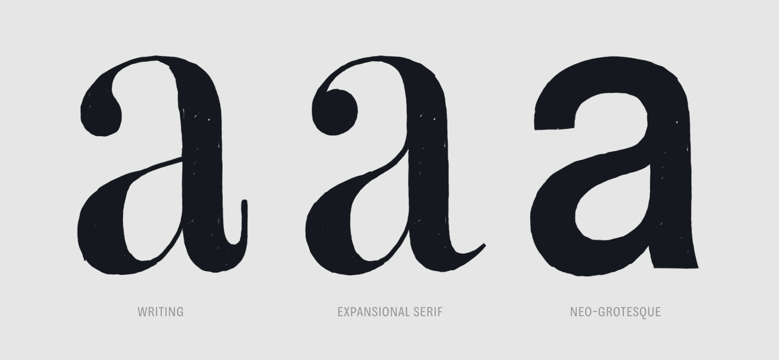
Latin typefaces are fundamentally shaped by the human hand: our letters come from handwriting and calligraphy, and our typefaces reflect this even today. Not only does the motion of a physical writing tool still inform the distribution of weight and contrast in a digital typeface, the underlying calligraphic model contributes profoundly to the typeface’s character. Early in the design process of MD System, I found that adding a slightly humanist model (characterised by an oblique, ‘translational’ contrast axis), the shapes immediately felt warmer and less mechanical. And by giving this contemporary sans an element of commonality with some of the very oldest serif typefaces, it became possible to pair MD System with a much wider variety of other designs.

With the basic shape language of MD System defined, then, I needed to address the second half of my original question: What makes a typeface practical to use?
The designspace of a typeface — the layout of its various styles — is a generally underestimated aspect of the design process. A typeface is a system of interrelated shapes, with the design of each shape dictated by not only historical precedent, and the preference of the designer, but also how that shape interacts within the system. A complex form like a double-story g can’t get as bold as a simpler shape like n while retaining its legibility, so either the boldest aspect of the typeface is limited by the boldest legible g, or the construction of the g must change. In myriad ways like this, the designspace both defines, and is defined by, the drawings within a typeface.


The designspace also forms a fundamental interface between a typeface and the typographer using it. In building visual hierarchy and composition, while some tools like size and layout may always be available, many of the most powerful options are provided by the specific typeface being used: weight, width, obliqueness, optical size, and so on. The designspace is what controls which of these parameters are available, as well as to what extent they can be adjusted.
Therefore, the larger the designspace, the larger the typographer’s toolset. This isn’t necessarily always a ‘more equals better’ arrangement, however: it’s possible for a designspace to become too large, becoming unwieldy or even so expansive that styles within it no longer relate to each other.
With MD System, I wanted to define a designspace which would be broad, but predictable: large enough to give the typographer a wide range of options, but small enough to be understandable and cohesive.
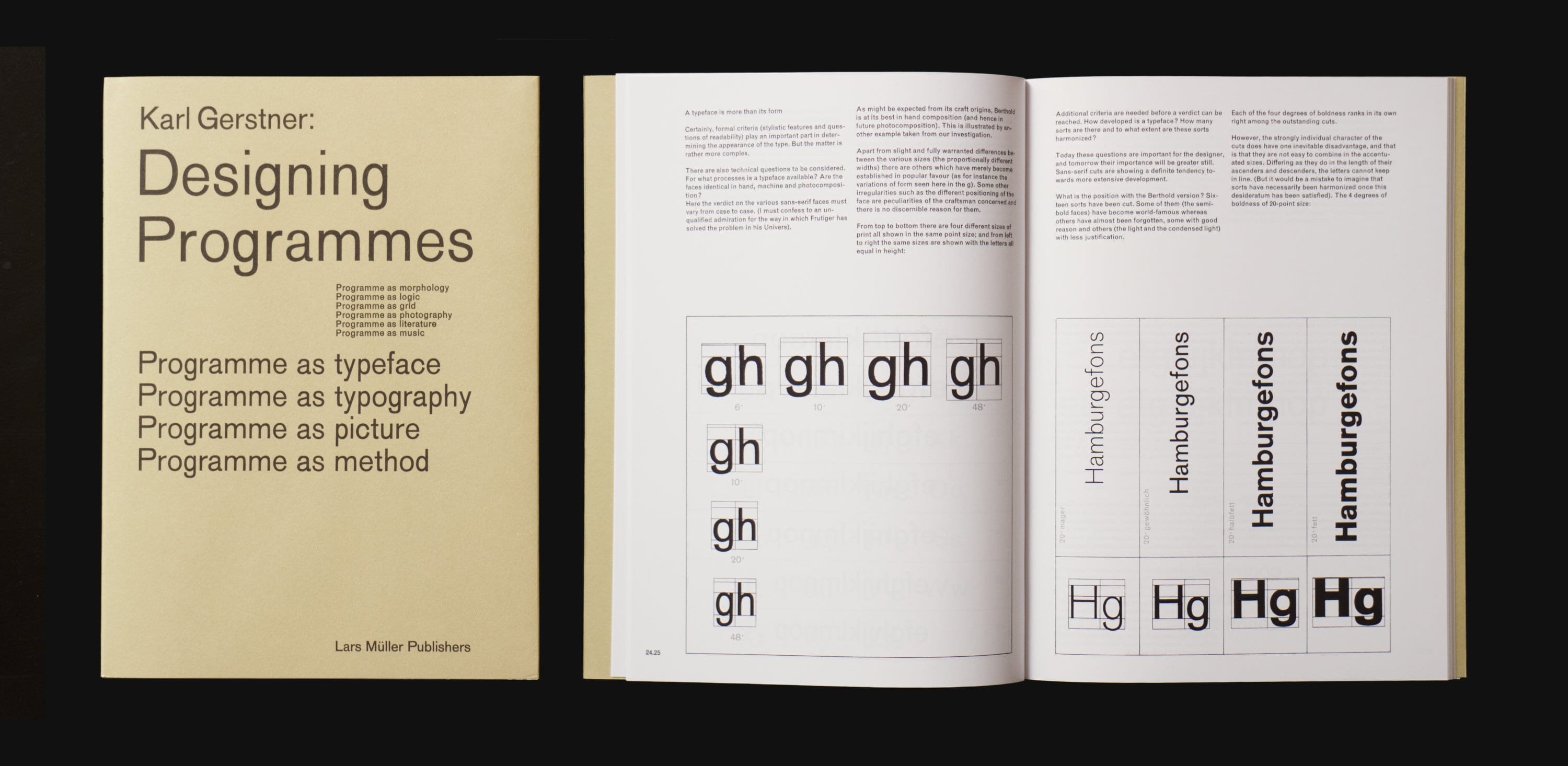
In 1963, Swiss designer Karl Gerstner published “The Old Akzidenz-Grotesk on a New Basis”, an essay in which he conceptualised a typeface very similar to the one I was sketching. His system took the underlying forms of Akzidenz-Grotesk, a design first published by Berthold in 1898, and uniquely expanded them into what resembles the contemporary idea of a designspace. Gerstner’s typeface was expressed across three axes: width, weight, and obliqueness, with a fourth axis, size, noted as being handled by the Diatype apparatus through which the typeface was used.
Gerstner’s system was built on a fundamental ratio of 1.25, which is to say that each width would be 25% wider than the previous, and each weight 25% bolder than the previous. He also defined an italic angle of 12° (“78° to the horizontal”).
In the summer of 2019, my former design history teacher (and, indeed, type design mentor), Tim Donaldson, introduced me to Gerstner’s essay in response to my early sketches of MD System. I was astonished by the similarity between Gerstner’s system and my own design, particularly in how mutually our decisions had converged on the same grotesque model, and how well I could relate to Gerstner’s rationale for the project. On the importance of a well-defined designspace, he put succinctly: “Isn’t the typographer free to combine whatever they like? No, they are only free to combine the material that is available.”
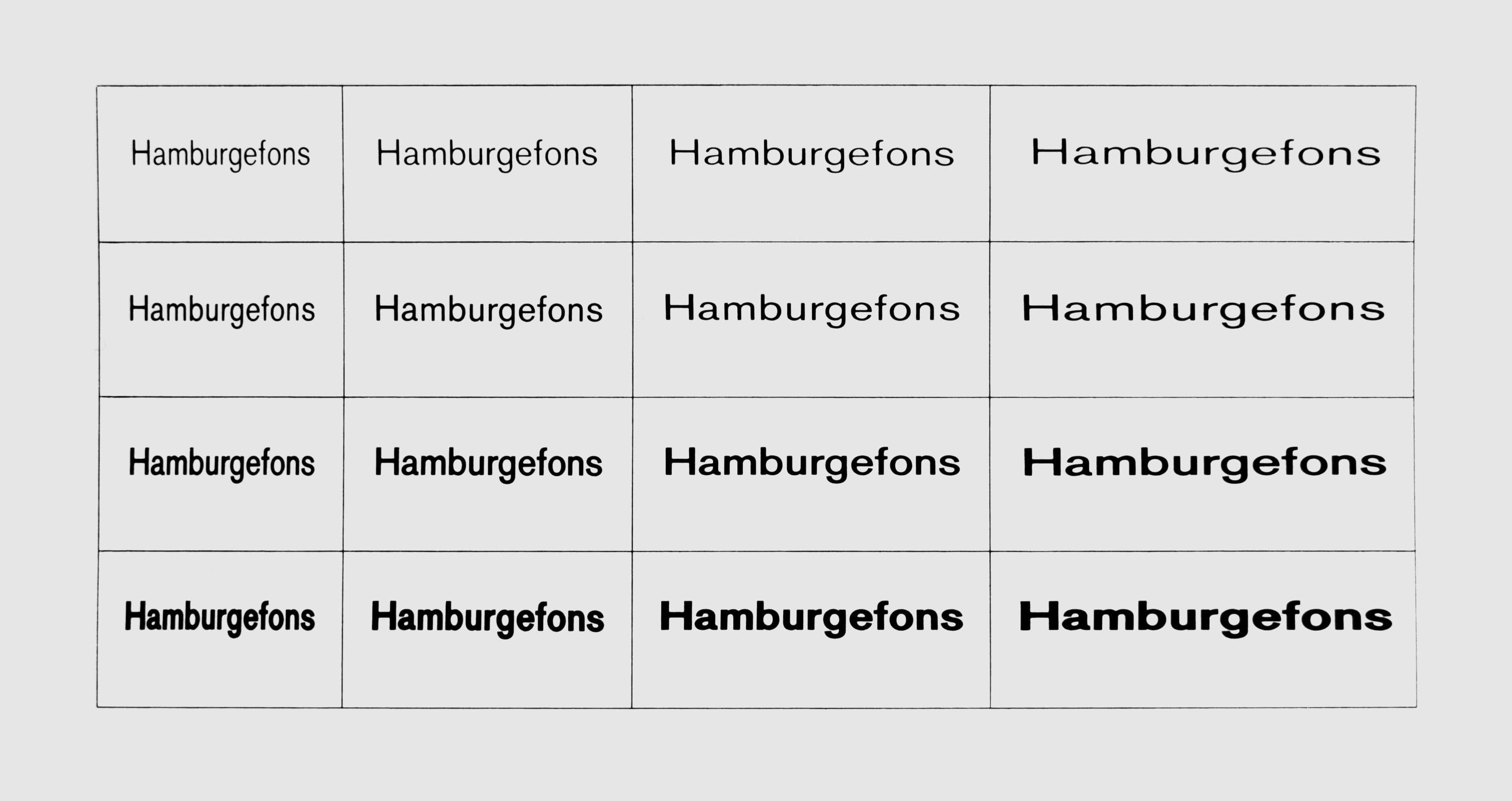
As presented in his 1963 essay, however, Gerstner’s typeface would have needed extensive manual corrections to be successful: just as the human hand is the original creator of typographic shapes, so is the human eye the ultimate audience — and Gerstner’s strict mathematical ratios and photomechanical stretching satisfy neither.²
Interpreted literally, Gerstner’s system doesn’t satisfy the expectations of a traditional typeface: because the widths are created by stretching, the relative weights of vertical and horizontal lines are inconsistent. And with increasing weight, Gerstner’s design appears to become more condensed — a result of the width not adapting to account for the thicker strokes. These effects may not be major, but without being compensated for, they ironically result in the opposite of what Gerstner’s mathematical logic intended: changing either the width or the weight in isolation appears to also change the other slightly.
In defining the weights and widths of MD System, I wanted to ensure from the beginning that the typeface was optically rather than mechanically precise, which fundamentally meant ignoring the actual measurements. For instance, reducing the width of a letter, without changing anything else, will result in the narrower version appearing too bold. When drawing the condensed versions of MD System, I had to reduce their weight — and adjust their x-heights, and change some relative letter widths, and so on — to maintain optical consistency.

While this was a complex (and time-consuming) process, its effect is significant. By building the complexity of optical compensations into the design itself, rather than leaving them to be fixed at the point of use, MD System’s designspace feels fundamentally predictable — and thus the need to learn the typeface’s idiosyncrasies is reduced.
Another factor that contributes to that predictability is the consistency of MD System’s forms. It’s not uncommon for typefaces to adapt the constructions of certain glyphs in an effort to enlarge the designspace. As round shapes like o and the bowls of bdpq become narrower, for example, their balance of roundness and stroke weight becomes harder to control. To counteract this, it’s typical for shapes like these to gain straight segments, flattening at the sides in an effort to remain balanced and prevent spacing issues.

My problem with this, at least in the case of MD System, is it results in a design motif which changes across the designspace: the most condensed styles have flat-sided shapes, where the wider styles have round-sided ones. That may not seem like a huge issue — indeed, it’s rarely a dealbreaker — but for my design, it detracted from that fundamental accessibility. Every inconsistent design decision in a typeface steepens the learning curve for a typographer using it.³
Consistency of shapes was therefore what ultimately defined the edges of MD System’s designspace. Starting with the regular style, the condensed width was simply the narrowest I could make the letters without needing to change their designs. Similarly, the ‘Black’ weight was the boldest I could make the shapes before their legibility was compromised.⁴

Rather than four weights and four widths, as Gerstner produced, I instead decided on five weights and three widths. Along the weight axis, five values allowed for a bolder maximum weight while retaining reasonably granular control;⁵ in terms of width, I decided against the wider cuts of Gerstner’s system in favour of a narrower Condensed style and a second option between that and the Regular. During testing, I also split the typeface into distinct subfamilies for each width — in desktop design software, this makes it possible to change the width of a paragraph without resetting any bold or italic styles within it.
I briefly mentioned before that Karl Gerstner’s parametric typeface had four axes — weight, width, obliqueness, and size — with the size axis being handled by the Diatype phototypesetting machine. Functionally, what this means is that the scale at which the typeface is reproduced can be continuously changed,⁶ and as it changes, the tracking (or letter-spacing if your native language is CSS) is automatically adjusted to compensate. Since smaller text requires more space between letters to maintain its readability, this emulates the traditional handcrafted suite of optical sizes with moderate success.
There’s more to optical sizing of typefaces than just tracking, of course: factors like letter width and vertical proportions, as well as rendering and reproduction considerations like contrast level and the need for ink traps, all contribute to a typeface’s functionality across different scales. But that said, a few smaller decisions in the design of a typeface, coupled with tracking adjustments, can go a long way to broaden the range of sizes at which a typeface can work.
As a grotesque design, MD System naturally has a fairly low amount of contrast — its lightest strokes are still moderately thick, allowing them to hold up at smaller sizes. On top of this, I drew intersections (like where the shoulder of n or the bowls of bdpq attach to the stem) to be deeper than normal and more pronounced in the bolder weights, again to ensure they remain visible as the typeface becomes smaller. Conversely, while letters are almost always trivial to space out at small sizes, wherever possible I drew shapes to be tolerant of negative tracking at larger ones, allowing the typeface to function at display scales as well as for smaller text.


I’m wary of any claim that a typeface works “at all sizes,” or “for text and display use”: a typeface is designed for a small window of possible sizes, and MD System is no exception. It does, however, endeavour to make that window as large as possible: in my proofs during the design process, I tested it between 7 and 72pt (with manual tracking adjustments at either end of the scale).⁷
Finally, the limit of a typeface’s practical usability is defined by the glyphs it contains. A typeface with a near-infinite designspace is only worthwhile if it contains the letters, diacritics, numbers and symbols you need. To that end, MD System’s glyph set is the largest of any design I’ve produced: not only does it support codepoints for over 300 Latin-based languages,⁸ it includes various OpenType features for detailed typographic control.
Alongside a complete set of small caps — including numbers and currency symbols — there’s a set of stylistic alternate forms designed specifically for legibility,⁹ preventing confusion between the uppercase I and lowercase l. Similarly, an alternative ‘slashed zero’ can be used to prevent confusion with the letter O, which works for all five sets of numbers: tabular, proportional, lining, oldstyle, and small caps. And all of these features are included for every style, not just the Regular.


Through the three distinct axes of weight, width, and obliqueness, as well as with specific compensations to allow for a range of sizes, MD System is the most versatile design I’ve ever conceived. By maintaining consistent shapes and predictable width and weight variations, its full range of styles can be used with minimal friction — either through its 30 defined instances, or through the near-infinite flexibility of a variable font — while a substantial glyph set and meaningful OpenType features means each style remains useful even in isolation. And by combining the ubiquitous model of a grotesque with details from humanist designs, MD System becomes stylistically appropriate in a wide range of contexts, without resorting to blandness.
Akzidenz-Grotesk, the model on which Karl Gerstner’s parametric design was based (and an enduring reference during MD System’s design process), takes its name from the concept of ‘Akzidenzdruck’: commercial or jobbing printing; everything from leaflets and tickets to restaurant menus and office paperwork. 120 years on, while the nature of that work has changed, the need for general-purpose workhorse type remains.
MD System is my response: it’s a typeface for leaflets and restaurant menus, but also for websites and user interfaces; the myriad applications which have appeared and evolved between Akzidenz-Grotesk’s conception and today. It’s a type system for your next design system — and, after almost three years of consideration, my answer to the question: What does it mean for a typeface to be useful?
MD System was originally released as a smaller family of one width in February 2020, and updated to include its full scope in May 2022. I’d like to particularly thank Tim Donaldson for introducing me to the work of Karl Gerstner; Luke Charsley for his feedback and advice throughout the design process; Frank Grießhammer for his technical expertise; and everyone who licensed the earlier versions of MD System, for enabling me to continue the project.
You can license MD System from €50 per style for commercial use, with free trials also available. A variable font version is included on request with licenses of the complete family.
→ Buy MD System
→ Visit the Microsite
→ Download PDF Specimen