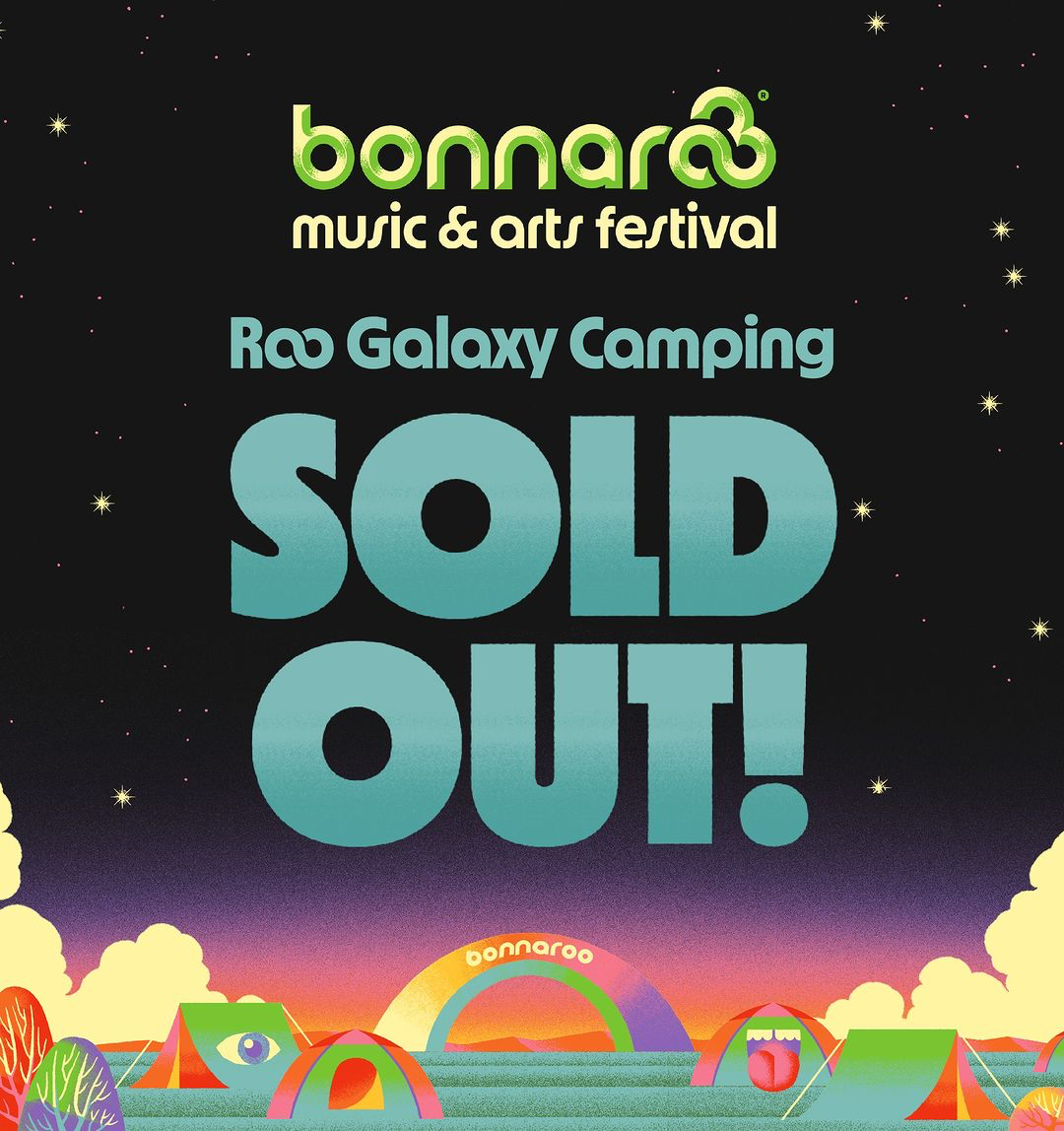
First held in 2002, Bonnaroo is an annual music and arts festival in Manchester, Tennessee. Ahead of their 2023 event, the festival’s organisers reached out to us about using MD Nichrome — and about making the typeface a little more Bonnaroovian.
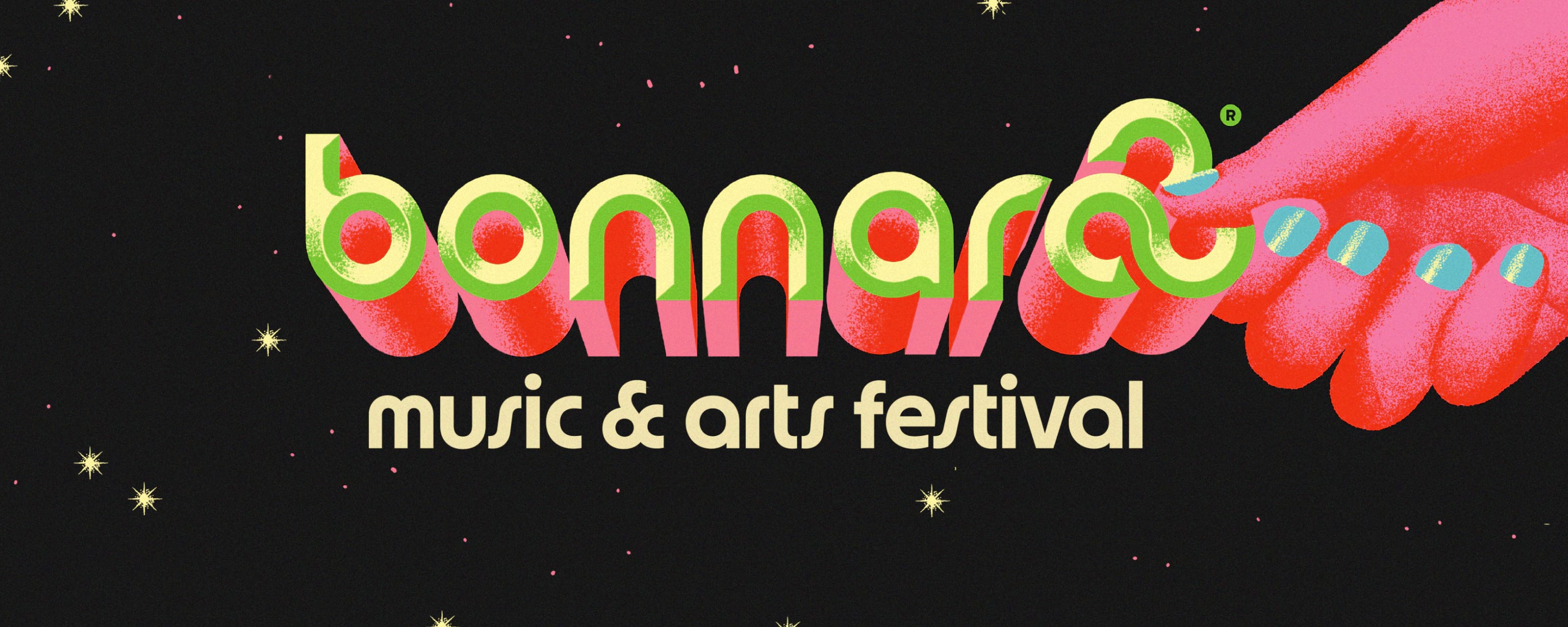
In particular, the idea was to bring Nichrome’s visual style more in line with Bonnaroo’s logo: perennial and beloved, the iconic triple-infinity sign and Bauhaus-inspired geometric wordmark are the cornerstone of a brand that otherwise reinvents itself every summer.
In practice, that meant focusing on some key glyphs: we redrew the lowercase a, b, d, p and q to match the logo’s more circular construction, simplified the t, added a new question mark, and switched out the default m, n, r and u for their existing rounded variants.


The final element was an all-new ampersand, which references the infinity logo while remaining legible as a symbol. We christened the new typeface MD Bonnachrome, a name which embodies the same playfulness as the brand — and the festival itself.


Alongside the typeface, we also worked on tidying up Bonnaroo’s ‘music & arts festival’ subtitle. While keeping the same style and approximate proportions as the original, we balanced the letter widths and the spacing, smoothed the curves, and redesigned the ampersand to match the custom typeface.

Lettering rather than type, the subtitle’s shapes could be tailored more precisely to the logo and to each other: each instance of the letter s, for instance, has a slightly different angle and width to allow for better spacing.


MD Bonnachrome rolled out in stages, the last of which was a set of eye-catching OpenType features for display use. Referencing the logo, we drew two double-o ligatures (and one triple-o one), which connect to form an infinity-like mark. In headlines and short texts, these give a sense of playfulness to the typography, while still remaining fundamentally legible.


We also added a handful of emoji-style glyphs, to be used as throughout the festival’s creative materials. (Personal favourite: Bonnaroovian figures, with dynamic context-aware hand-holding.)
For easier typesetting, we programmed these glyphs to be accessible via memorable shortcuts: <3 becomes a heart, :) a smiley face, ?? turns into an alternate question mark, and any number of hand-holding people can be created by typing /\ one or more times.
The result is a typeface that complements both the visual language and the playful attitude of Bonnaroo. It’s a design that provides a broad palette of typographic options for the festival’s creative team, and which feels right at home as part of its visual identity — both for this year’s event, and for the future.
The art director for this project was Anna Woodard; illustrations are by Max Löffler. MD Bonnachrome is a custom font based on MD Nichrome.